The Honest Advertiser's Guide to Google Ads Images: What the Spec Sheets Don't Tell You
What are the exact Google Ads image sizes, formats, and logo specifications? This is Step-by-step optimization guide with real use cases and conversion workflows.
The Honest Advertiser's Guide to Google Ads Images: What the Spec Sheets Don't Tell You
Most guides on Google Ads image requirements read like a copy-paste from Google's own documentation. This one won't. Instead, let's talk about what actually happens when you get the specs wrong, why the "minimums" are a trap, and how professional media buyers think about creative assets differently from everyone else.
Stop Treating Image Specs as a Checklist
Here's a mindset shift worth having early: Google's image requirements aren't a compliance exercise — they're a signal system.
When Google says the minimum square image size is 300 × 300 pixels, it isn't giving you permission to use a 300px image. It's telling you the floor below which the system physically rejects your upload. Using an image at exactly the minimum is like showing up to a job interview in the least wrinkled shirt you own. You cleared the bar. You didn't impress anyone.
The real question isn't "will this image be accepted?" It's "will this image compete?"
The Two Ratios That Govern Everything
Before memorizing any pixel dimensions, understand one foundational principle: Google Ads image logic is built entirely around two aspect ratios.
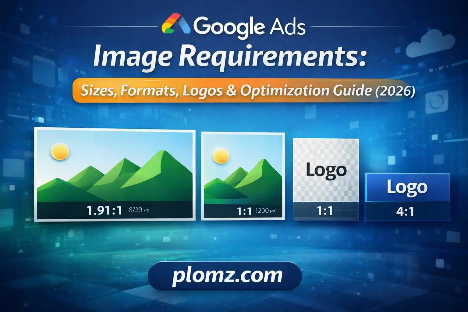
1:1 (Square) — used for feed placements, Discovery cards, mobile display units, and Gmail promotions where content is presented in a grid or card format.
1.91:1 (Landscape) — used for banner-style placements, YouTube companion ads, and the classic horizontal display units that dominate desktop web browsing.
Every size specification you'll encounter is just a resolution expression of one of these two ratios. Once you internalize that, the spec tables collapse into a single practical rule:
Always upload both ratios at 1200px on the longest side. Everything else is a detail.
Why 1200px Is the Number That Actually Matters
Google's recommended resolution of 1200 × 1200px and 1200 × 628px isn't arbitrary. It maps to real-world display conditions:
Modern smartphones — including the devices where Google Ads generate the majority of impressions — use 2× and 3× pixel density screens. A "300px" slot on a Retina display actually draws from a 600px or 900px source image. If your source image is only 300px wide, it's being upscaled, and the result is visibly blurry to anyone on a flagship Android or iPhone.
Uploading at 1200px means Google's system can serve your image crisply at any density without upscaling. This is the invisible difference between ads that look professional and ads that look like stock photos from 2011.
What the Ad Strength Score Is Actually Measuring
Google Ads surfaces an "Ad Strength" rating for Performance Max and Responsive campaigns. Most advertisers treat this as a vanity metric. It isn't.
Ad Strength is a proxy for auction eligibility. Here's what's actually happening under the hood:
Google's system assembles ads dynamically from your asset library to match each available placement. If a placement requires a landscape image and you haven't uploaded one, Google doesn't serve a stretched square — it skips that placement entirely. You never see the missed impression. It just doesn't happen.
This means an advertiser with "Excellent" Ad Strength isn't just getting a gold star. They're literally competing in more auctions than the advertiser with "Poor" strength. The spec compliance translates directly to impression share.
The practical implication: Every asset type you're missing isn't a cosmetic gap — it's a closed door to a category of placements.
The Full Asset Set Professional Media Buyers Actually Upload
Here's what a properly built Performance Max campaign looks like from an asset perspective, with the reasoning behind each requirement:
| Asset | Recommended Size | Why It Matters |
|---|---|---|
| Square image | 1200 × 1200px | Feeds, Discovery, Gmail grid |
| Landscape image | 1200 × 628px | Display banners, YouTube companions |
| Portrait image (Demand Gen) | 960 × 1200px | Mobile full-screen, Shorts adjacent |
| Square logo | 1200 × 1200px | Overlaid on ad units, must be clean |
| Landscape logo | 1200 × 300px | Header and banner branding |
Notice the portrait format at 960 × 1200px for Demand Gen. Most guides omit this entirely. On mobile, portrait images occupy significantly more vertical screen real estate than landscape assets, which translates to higher visual impact and — in most verticals — measurably better CTR. It's the most underused format in the toolkit.
The Logo Problem Nobody Talks About
Logos in Google Ads are not decorative. They're trust signals placed by the system at small sizes, sometimes as small as 44px in rendered output, next to your headline and description.
Two things routinely destroy logo performance:
1. White or light-colored backgrounds. Google places your logo on surfaces you don't control — dark card backgrounds, light feed environments, colored Gmail tabs. A logo with a white rectangular background looks broken on dark surfaces. A logo with a transparent background adapts cleanly to any context. Always export logos as PNG with transparency.
2. Logos designed for print, not screen. If your logo was originally created for business cards or letterheads, it was likely designed at high resolution for CMYK print output. Thin strokes, fine serif details, and small supporting text that read beautifully at 300 DPI print resolution become illegible at 44–128px screen display. If your logo doesn't read clearly at 100px wide, you need a simplified digital variant — not a pixel-perfect reproduction of the full identity.
The recommended square logo upload size is 1200 × 1200px, and the landscape version is 1200 × 300px, but the working size you're optimizing for when you design is considerably smaller.
Format and File Size: The Nuanced Version
Google accepts JPG and PNG. That's the simple answer. Here's the nuanced version:
Use JPG for photography. Photographs with complex color gradients compress efficiently in JPG without visible quality loss. A well-optimized product or lifestyle photograph should land between 150KB and 400KB at 1200px resolution.
Use PNG for anything with flat color, text, or transparency. PNG handles sharp edges, solid color blocks, and text overlays without the compression artifacts that make JPG unsuitable for graphics. Logos should always be PNG.
The 5MB limit is not a target. It's a ceiling that exists for upload infrastructure reasons. In practice, no image you serve in a Google Ads placement needs to be larger than 600KB. Files larger than that are typically unoptimized exports from design tools — Photoshop saving at 100% quality, Canva exporting with no compression, Illustrator rasterizing at maximum resolution. These large files don't improve ad performance; they just slow down your upload workflow and occasionally cause rendering inconsistencies in Google's preview system.
Compress before uploading. Always.
What High-Performing Ad Images Actually Look Like
Technical compliance gets your images into auctions. Creative quality determines what happens next. Here's what the data from thousands of display campaigns actually shows:
Single dominant subject beats busy compositions. In environments where your ad has 0.3 seconds to register before a user scrolls past, an image with one clear focal point — a product, a person's face, a single bold graphic — consistently outperforms scenes with multiple competing elements.
Contrast against feed backgrounds. Most feed environments are white or light gray. An image with a white background disappears into the page. Images with bold color blocks, dark backgrounds, or strong saturation stand out. This sounds obvious and is routinely ignored.
Minimal text in the image itself. Google's system adds headlines and descriptions from your asset library. When advertisers also add text overlays to their images, the result is typically cluttered and difficult to read at small sizes. The image's job is to stop the scroll. The text assets close the sale.
Real product or real people over generic stock. Google's own Creative Best Practices research consistently shows that authentic photography — actual products, actual customers, actual environments — outperforms generic stock imagery in conversion rate. This is especially true in verticals where purchase decisions involve trust (finance, healthcare, legal services).
A Practical Pre-Upload Workflow
Before any images go into a Google Ads campaign, run them through this sequence:
- Confirm aspect ratio. Open the image. Verify it's either 1:1 or 1.91:1. Crop if necessary before resizing to avoid distortion.
- Check resolution. Square images should be 1200 × 1200px. Landscape images should be 1200 × 628px. If they're larger, that's fine. If they're smaller, resize up only if the source quality supports it — a 400px image scaled to 1200px is worse than a 400px image left at 400px.
- Verify format. Photography → JPG. Graphics/logos/anything with transparency → PNG.
- Check file size. If the file is over 600KB, compress it. If it's a PNG logo over 1MB, something went wrong in the export process.
- Preview at small sizes. Before uploading, manually resize your browser preview to see what the image looks like at 200px wide. If the key message is illegible at that size, the creative needs revision.
The One Mistake That Costs the Most Impressions
If there's a single error to eliminate from your campaign setup, it's this: uploading only landscape images and skipping square format.
Landscape images are intuitive to produce because they match how we think about screens — wide, horizontal, cinematic. Most design handoffs default to landscape. Most brand photo shoots produce landscape crops.
But a significant share of Google's highest-value placements — Discovery feed cards, Gmail promotional tiles, mobile display units — are square-dominant environments. Campaigns missing square assets are excluded from these auctions entirely, with no error message and no warning. The impressions simply don't happen.
Upload both ratios. Every time. For every campaign.
Summary: The Specs That Actually Matter
| Requirement | Value | Why |
|---|---|---|
| Square image size | 1200 × 1200px | Full density for mobile screens |
| Landscape image size | 1200 × 628px | Banner and companion placements |
| Portrait image (Demand Gen) | 960 × 1200px | Mobile feed advantage |
| Logo format | PNG with transparency | Renders on any background |
| Square logo | 1200 × 1200px | Clean at any rendered size |
| Landscape logo | 1200 × 300px | Header branding placements |
| File format | JPG (photos), PNG (graphics) | Appropriate compression per type |
| File size target | Under 600KB | Not the 5MB maximum |
| Minimum to avoid | 300 × 300px square / 600 × 314px landscape | These are rejection floors, not goals |
The advertisers consistently generating the best results from Google's asset-driven formats aren't doing anything exotic. They're uploading complete sets of correctly sized, well-compressed, purposefully designed images — and then letting Google's system do what it's designed to do: find the right creative for the right person at the right moment.