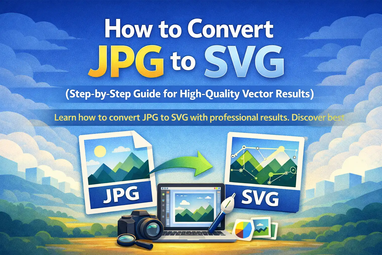
The Honest Guide to JPG → SVG Conversion (What Most Tutorials Skip)
Learn how to convert JPG to SVG with professional results. Discover best practices, platform requirements, file optimization tips, and tools to create scalable, lightweight vector graphics for logos, print, web, and cutting machines.
The Honest Guide to JPG → SVG Conversion (What Most Tutorials Skip)
Why Your Vectorized Logo Still Looks Wrong
Here is something the conversion guides never tell you: auto-tracing a JPG doesn't create a vector — it creates a photograph made of polygons. The math is different, but the problem is the same. You haven't escaped the pixel. You've just described it differently.
Understanding this gap is what separates designers who get usable SVGs from those who keep re-uploading the same blurry logo into converter after converter, wondering why the result always looks slightly wrong.
What "Vector" Actually Means (And Why Your Converter Lies to You)
A true vector graphic is designed as a vector. It's built from the mathematical relationships between points — not approximated from a grid of colored squares.
When you feed a JPG into a tracer, the software is doing something fundamentally different: it's reading color neighborhoods and guessing where edges should be. The result is a file with a .svg extension that behaves like a vector but thinks like a photograph.
This distinction has real consequences:
- A designed logo at 50 nodes scales flawlessly and prints at billboard size
- A traced logo at 50,000 nodes may print similarly but will crash Cricut, choke a laser cutter, and add 400KB to your webpage
The converter didn't lie to you about the format. It lied about the outcome.
The Source Image Is Doing 90% of the Work — Here's the Proof
Run this test on any auto-tracer:
- Take a JPG logo saved at high quality (low compression)
- Trace it — note the node count and file size
- Now take the same logo saved at low quality (heavy compression)
- Trace it — the node count will be 3–5× higher for an identical image
Why? JPEG compression creates artifacts — faint color halos, micro-banding, soft edges — that the tracer reads as legitimate detail. It dutifully converts that noise into paths. You end up with thousands of nodes describing camera grain that was never part of your logo.
Practical takeaway: Before touching a converter, run your JPG through a PNG export at maximum quality. Lossless formats don't carry compression ghosts, and your trace will be dramatically cleaner. This single step does more than any "smooth paths" slider in the converter UI.
The Platform Problem Nobody Talks About
Different platforms don't just accept SVG differently — they actively interpret the same file in completely different ways:
Web Browsers
Render SVG as a live DOM element. This means your SVG can be styled with CSS, animated with JavaScript, and targeted by accessibility tools. But it also means a poorly structured SVG can break your entire layout — mismatched viewBox attributes, missing xmlns declarations, or embedded raster images will render inconsistently across Chrome, Safari, and Firefox.
Cricut / Silhouette Design Space
These don't render your SVG — they cut it. They're looking for closed paths with clear interior/exterior logic. An open path that looks fine visually will be read as "no cut here." The machine pauses, drags, or skips. The result is a physical object that doesn't match your screen — and wasted material.
Figma / Sketch / Affinity Designer
Import your SVG and immediately check the Layers panel. If you see one flattened shape instead of organized, named components, the file is designer-unusable — even if it looks correct. A production SVG should be structured so a human can navigate it.
Embroidery Software
This is the harshest filter of all. Embroidery converts paths to stitch sequences. Gradients are impossible. Semi-transparent fills don't exist. A traced SVG with subtle color blending will be either rejected outright or converted to flat, ugly color blocks by the software. You need 2–6 solid, clearly separated colors with hard boundaries.
A Workflow That Actually Works (Built Backwards From the Output)
Most guides tell you to start with your image and work forward. Start instead from where the file needs to go, then build the preparation process accordingly.
If the destination is a website:
- Target: under 20KB, valid XML, no embedded rasters
- Prep: Convert JPG → PNG, remove background, use color-limited tracing (2–4 colors), run through SVGO or Vecta.io nano
- Validate: Drop the file into an SVG validator before deploying
If the destination is a cutting machine:
- Target: Closed paths, single color or clearly separated color groups, under 500 nodes for small designs
- Prep: Convert to black and white before tracing, set the tracer to maximum simplification, manually close any open paths in Inkscape
- Validate: Open in the cutting software's own preview before printing anything
If the destination is a print shop or brand system:
- Target: Outlined fonts, CMYK color values, no clipping masks
- Prep: Any traced SVG should be taken into Inkscape or Illustrator for manual cleanup — automated tracing alone is not print-production-ready
- Validate: Export a PDF proof at 100% size and inspect edges at full zoom
The Node Count Test: A Simple Quality Metric Nobody Uses
After conversion, open your SVG in Inkscape and check Edit → Find/Replace with object type set to paths, or use the XML editor to count path elements.
| Design Type | Acceptable Nodes | Warning Zone | Reject |
|---|---|---|---|
| Simple logo | < 200 | 200–1,000 | > 1,000 |
| Icon / UI element | < 500 | 500–2,000 | > 2,000 |
| Cutting machine design | < 300 | 300–800 | > 800 |
| Web inline SVG | < 1,000 | 1,000–5,000 | > 5,000 |
A traced photograph of a face will typically exceed 50,000 nodes. That number tells you everything — the format is SVG, but it is not a vector in any meaningful design sense.
When Not to Convert (The Answer You Actually Need)
The honest answer that conversion tool websites will never give you:
Some images should never become SVGs.
If your image contains:
- Photographic depth, shadow, or skin tones
- More than 8 distinct color regions
- Fine texture (fabric, wood grain, fur)
- Soft focus or shallow depth of field
...then vectorization will produce a file that is larger, uglier, and less usable than the original JPG. The right answer in these cases is a high-resolution PNG, not an SVG.
SVG is a format for designed geometry, not captured reality. Conversion tools obscure this because their business model depends on you believing the process always works.
The One Manual Step Worth Learning
If you only learn one thing from this guide, make it this: Node simplification in Inkscape.
After tracing any image:
- Select all paths —
Ctrl+A - Open Path → Simplify (
Ctrl+Shift+M) - Adjust the simplification threshold until edges look smooth without losing shape
- Check the node count before and after
A well-simplified trace can drop from 8,000 nodes to 600 without visible quality loss. This is the difference between an SVG that crashes a cutter and one that works perfectly — and it takes under three minutes.
No online converter does this for you, because it requires human judgment about which detail matters and which is artifact noise.
The Real Skill: Knowing What You're Looking At
The designers who produce clean, platform-accepted SVGs consistently aren't using better tools. They're applying a different mental model:
They treat conversion as a first draft, not a finished product.
They expect to open the result in a vector editor. They expect to delete ghost paths. They expect to merge shapes and close gaps. The converter gets them 70% of the way there — the remaining 30% is the craft that makes the file genuinely usable.
That 30% is invisible in the final output. But every platform that touches your file will feel it.